
Never rotate, skew or distort the logo.
Find out how our logo should be used and how to apply it to your designs.
If you’re working with a roster designer, they already have all our assets including logo.
If you’re not, send us your request to use the logo including draft artwork. Email dcm@sussex.ac.uk.
We may request some changes to the design before providing a high-resolution logo.
All schools, departments and units at Sussex must follow our brand guidelines. Doing so maximises the reach of your work and builds on the strengths of our collective effort. You should never make your own logo or create a sub-brand.
If you need the logo please contact the DCM team with details regarding its proposed use: dcm@sussex.ac.uk.
The University of Sussex logo is one of the most important components of our identity. Together with our other core elements – colour, typography and tone of voice – it expresses who we are.
Make sure the logo is used correctly to maintain a strong and clear identity.

The logo comprises two elements: the US symbol and the “University of Sussex” wordmark.
These elements sit on a central axis and the logo should always be centred. This reflects the centrally-aligned look of early Sussex publications.
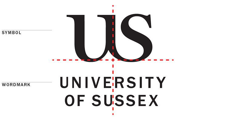
The logo must always appear with a minimum clear space around it that is twice the height of the Y in the wordmark. This is to protect the clarity and visual integrity of our logo.

To ensure legibility the logo must never be reproduced at widths less than:
12mm for print applications
70px for on-screen applications.
Measure the width from the widest part of the wordmark.
Make sure the logo can be read easily on-screen as readability can be affected by resolution, device size and applications.
Use these measurements to guide the width of the logo on each size of communication:
A2 – 42mm
A3 – 30mm
A4 – 22mm
A5 – 16mm
A6 – 12mm.
If the format is not a standard ‘A’ size, measure based on the closest ‘A’ size.
The most common colourway for our logo is black on white, as shown above.
You can also use a colour from our brand palette.
Make sure the logo is legible. For example, use a light colour and a dark one to create a strong contrast between the logo and the background.
For screen use, ensure the colour combinations pass our accessibility guidelines.
Each logo should sit side by side and be equally balanced visually. They should be divided by a vertical rule.
Try to match the size and heaviness of each logo by eye to make them appear of equal importance.

The dividing rule should be the:
height of the US symbol
thickness of the letter I in our wordmark
distance from each logo of three Y characters from our wordmark.
Always use our approved artwork.
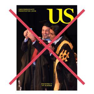
Do not try to alter or re-create the logo. This would undermine the integrity of our brand.
Never rotate, skew or distort the logo.

Never stretch the logo, vertically or horizontally.

Never colour the logo with a gradient or effect.

Never move or alter the elements in the logo.

Never outline the logo.

Never create your own spatial arrangements.

Never place the logo onto a coloured shape,
such as a circle or a square.
Always use central alignment when placing the logo.
The University of Sussex Business School and the Attenborough Centre for the Creative Arts have their own logos and identity guidelines.
See Business School branding guidelines.
All other schools, departments and units within the University of Sussex must follow our brand guidelines. Doing so maximises the reach of your work and builds on the strengths of our collective effort.
To make sure the Sussex brand is clearly visible to our audiences, always use our logo. Never make your own logo or create a sub-brand.
This includes adding the name of your school, department or unit in close proximity to the logo as a two-part lock-up.


Find out how to use our elements to follow the correct approach.