Using design elements for print
Understand our framework for producing designs that incorporate Sussex brand elements.
Contents
- symmetry in our brand
- logo
- page structure
- symbol-led versus copy-led approach
- our grid system
- typography
- tables.
Symmetry in our brand
The approach to our centred designs takes inspiration from the centrally aligned look of early Sussex publications.
Logo
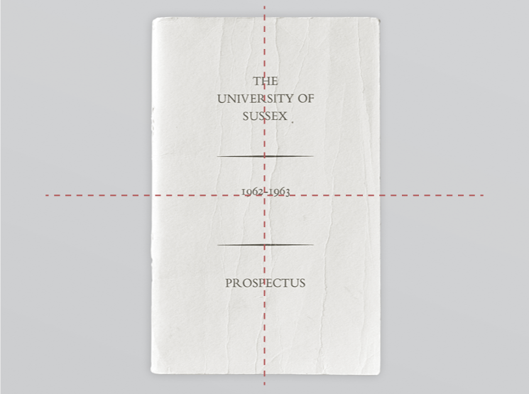
Our logo should always be horizontally centred. This central placement creates a strong axis that runs throughout communications, while framing surrounding content.
Preferably place the logo at the bottom margin. Where putting the logo at the bottom would compromise visibility, place it at the top margin instead.
This could be useful for exhibition stands or when brochures are displayed in literature stands.
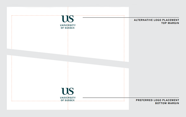
The logo should sit a clear distance from the bottom or top edge of the page. The minimum distance is the height of the symbol plus the height of a single line from the wordmark.
Displaying the name of a department, School or unit
We have created a system so Schools, departments and units at Sussex can fit seamlessly within our identity. To protect our reputation and to ensure consistency, these should be applied in a consistent manner.
You can add the name of a department, School or unit to give it prominence. Place this at the top margin of your design, centred, in the style of a running head (see typography).
Do not combine names of departments, Schools, professional services units and teams with the Sussex logo.
Read about our logo.
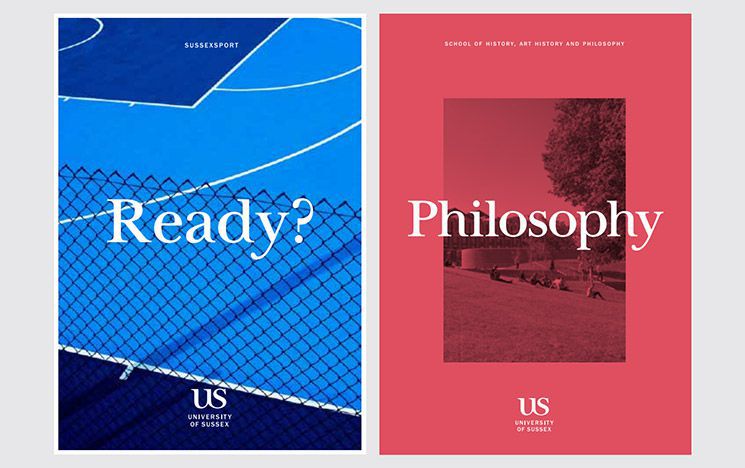
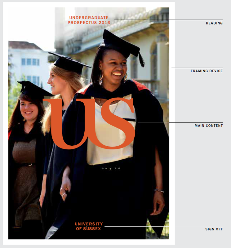
Page structure
Our page structure can be used for many applications including literature covers, posters and postcards.
The page is divided into three parts:
Heading
The heading of the composition is where the School, Unit, Title or URL should be placed.
Main content
The centre of the composition is where the main content is placed – either copy-led or symbol-led.
Sign off
The bottom of the composition is where the sign off should be placed – this can be the logo or wordmark.
Important: In exceptional circumstances, where placing the logo on the bottom margin would compromise visibility, use the alternative placement. This could be useful for exhibition stands or when brochures are displayed in literature stands.
Symbol-led versus copy-led approach
Our identity allows us to place either copy or the symbol at the heart of the work.
While they are similar in approach, there are slight differences in the placement of elements.
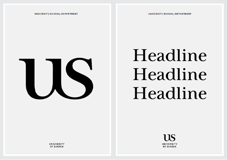
Symbol-led designs
These symbol-led approaches use the Sussex ligature as the symbol.
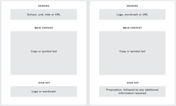
Page structure
The page structure of symbol-led work can be composed of the following elements:
Heading
The heading of the composition should contain the School, Unit, Title or URL, set in ITC Franklin Gothic Medium. The heading should always match the point size of the sign off.
Main content
The centre of the composition is where the symbol is positioned – it should be large, confident and dynamic.
Sign off
The bottom of the composition is where the sign off should be placed. This should be always be the logo or wordmark.
Framing device
If you’re using an image, apply the framing device. If it’s just copy, it can be ignored.
The framing device should be set to 5mm for A6, A5 and A4 formats, and 8mm for A3 and A2 formats.
The framing device should always be white – do not use colour.
Tip: If there are any print reproduction concerns about maintaining the correct margin, the framing device can be removed.
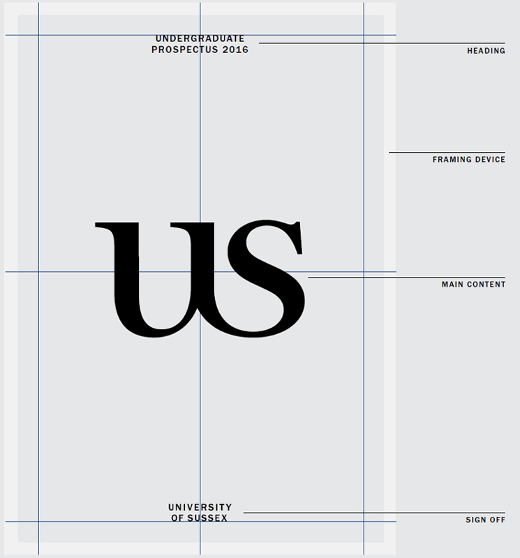
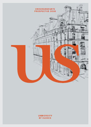
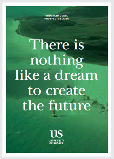
Prospectus cover example
This image shows a symbol-led prospectus cover treatment.
How the symbol works with other elements
When used as a graphic element the symbol can interact with other elements to create additional depth and interest.
Example 1
Example 2
Example 3
Important: In these examples minimum clear space rules do not apply. However, the symbol must always be centrally-aligned, both vertically and horizontally, to the page.
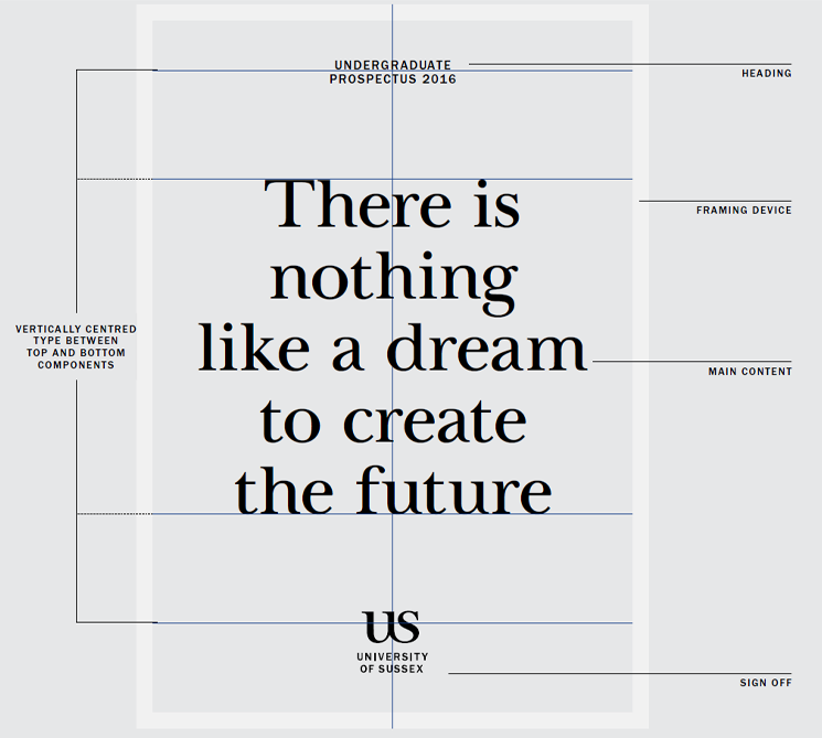
Copy-led designs
These examples show a copy-led approach using varied lengths and font sizes of copy.
Page structure
The page structure of copy-led work can be composed of the following elements:
Heading
The School, Unit, Title or URL, set in ITC Franklin Gothic Medium. This example has optical kerning and tracking set to +200.
Main content
Use UOS Baskerville Titling for copy. Like the symbol-driven option, this should be large, confident and central to the design.
Vertically, the type should be centrally-aligned between the bottom edge of the top component and the top edge of the bottom component.
Sign off
At the bottom, use the University of Sussex logo to sign off the page and centrally frame the copy.
Framing device
If you’re using an image, apply the framing device. If it’s just copy, it can be ignored.
The framing device should be set to 5mm for A6, A5 and A4 formats, and 8mm for A3 and A2 formats. If you’re working to a bigger canvas, scale up proportionately as you increase from A2.
Tip: If there are any print reproduction concerns about maintaining the correct margin, the framing device can be removed.
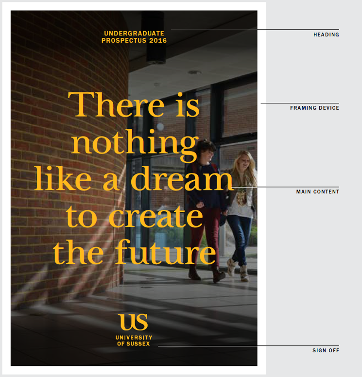
Prospectus copy-led example
This image shows a copy-led prospectus cover treatment.
Copy-led page examples
These examples show how the page structure can accommodate various text lengths, from single words to short statements or longer passages of text. Make sure all text remains legible.

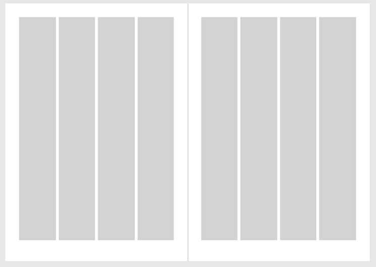
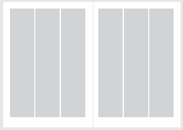
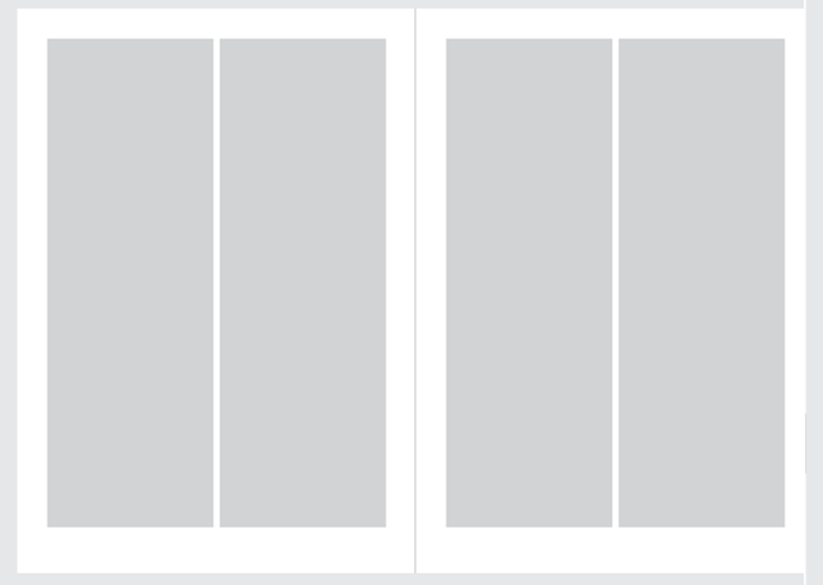
Our grid system
When using grids in University of Sussex literature, use a 12-column grid as a framework. This allows spreads to adapt to two, three and four columns, which gives you flexibility within layouts and greater freedom with content.
The 12-column grid can be used on any size and format.
Designers should use their judgment when considering margin and gutter sizes and keep these consistent throughout a piece of communication.

The diagrams below show a four-column, three-column and two-column grid. The gutters and margins are the same size in all examples.
Typography
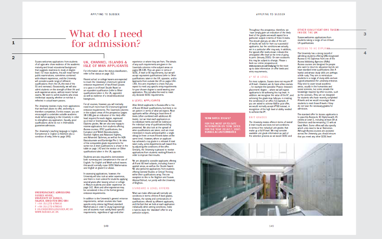
Shown below is a typical spread from a piece of printed Sussex literature.
The following principles for type styles should form the basis for printed literature designs.
Running heads
Marked 1 below – ITC Franklin Gothic Medium/uppercase/centred (this example has optical kerning and tracking set to +200).
Heading
Marked 2 below – UoS Baskerville Titling/sentence case/centred, optical kerning (this example has optical kerning and tracking set to -20).
Standfirsts
Marked 3 below – UoS Baskerville Titling/sentence case/centred (this example has optical kerning and tracking set to -10).
Page numbers
Marked 4 below – ITC Franklin Gothic Book/centred (this example has optical kerning and tracking set to +100).
Pull quotes
Marked 5 below – UoS Baskerville Titling/sentence case/centred or ranged left (this example has optical kerning and tracking set to -10).
Sub headings
Marked 6 below – ITC Franklin Gothic Medium/uppercase/centred or ranged left (this example has optical kerning and tracking set to +200).
Body text
Marked 7 below – ITC Franklin Gothic Book/sentence case/ranged left or centred (for longer passages of text always set text ranged left). (This example has optical kerning and tracking set to 0).
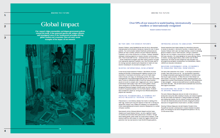
Use your judgement when considering text sizes and keep these consistent through your work.
For a guide to our heading hierarchy in web content, browse our web components library.
See what our fonts look like and how to get them.
Sub-head hierarchy
Shown below is a typical spread from a piece of Sussex literature.
The following principles for type styles should form the basis for sub-heading hierarchy.
Header
Marked 1 below – UoS Baskerville Titling, sentence case, centred, 100% tint.
Sub level 1
Marked 2 below – ITC Franklin Gothic Medium, uppercase, centred or ranged left, 100% tint.
Sub level 2
Marked 3 below – ITC Franklin Gothic Medium, uppercase, centred or ranged left, 100% tint.
Sub level 3
Marked 4 below – ITC Franklin Gothic Medium, uppercase, centred or ranged left, 60% tint.
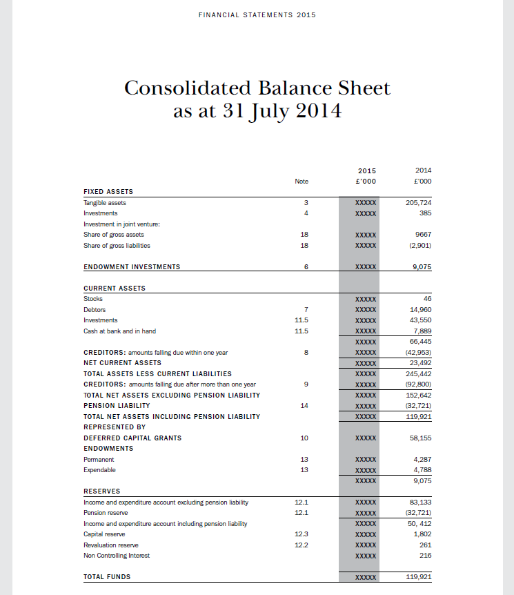
Tables
Shown below is a typical table structure from a piece of Sussex literature.
Take care laying out tables to ensure they are easily editable and, if published on-line, easily readable by screen readers. Tables should have a clear reading order and should be fully style-sheeted so screen reader tags can be applied.
The following principles form the basis for table styling.
Running heads
ITC Franklin Gothic Medium/uppercase/centred (this example has optical kerning and tracking set to +200).
Heading
UoS Baskerville Titling/sentence case/centred, optical kerning (this example has optical kerning and tracking set to -20).
Sub-headings
ITC Franklin Gothic Medium/uppercase/centred or ranged left (this example has optical kerning and tracking set to +200).
Horizontal rules
Extend the rule across the table when distinguishing major sub-sections, underlining the heading name and strengthening the structure.
For other rules, extend to the column of tinted cells as necessary.
Column highlight
Filled cells should be given a 20% black or a 30% tint of the subheading colour if applying a hue. Use your judgement when considering legibility and alter tints values if needed.
Inset tables
Shown below is an inset table to illustrate figures in the text.
Filled cells should be given a 30% tint of the subheading colour (marked 1 below). Use your judgement when considering legibility and alter tint values if needed.
Text-bordered margins above and below the table should be allowed an extra gutter-length’s space (marked 2 below).