Starting a new project
If you’re commissioning creative work, find out who to get in touch with and what to do.
Read our guidelines on articulating the Sussex brand in your work and communications.
To meet WCAG web accessibility standards we must make sure our web content is accessible for all visitors to our website. This includes web pages, video and audio content, as well as files such as PDF documents. To make sure all content produced is accessible, check our accessibility statement, read our staff guides, follow our how-to guides and, if you’re a site editor, use our web components.
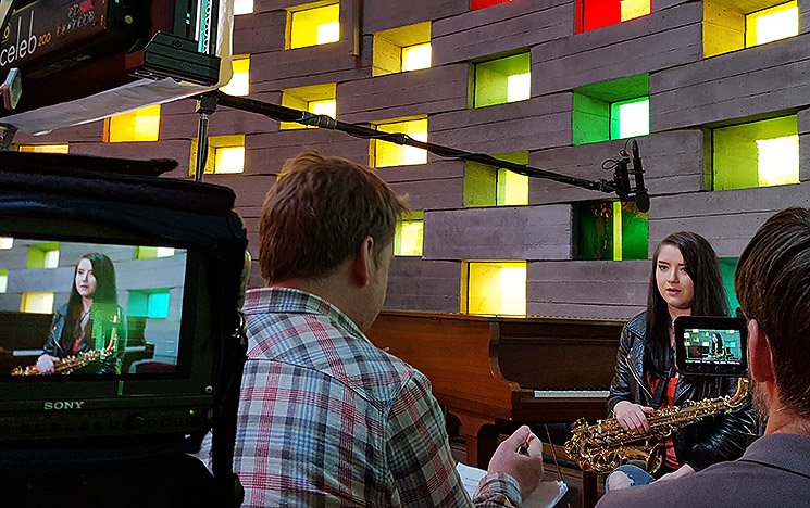
Asset Bank is our library of images for digital and print.
They’re on-brand, produced by us and ready to use.
Post
Sussex House SH-230
University of Sussex
Brighton BN1 9RH