This exhibition showcases work by students at Brighton Aldridge Community Academy (BACA) in a series of workshops on research, curating and illustration, devised by the University of Sussex’s School of English.
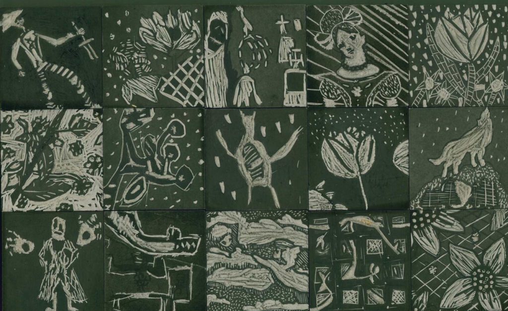
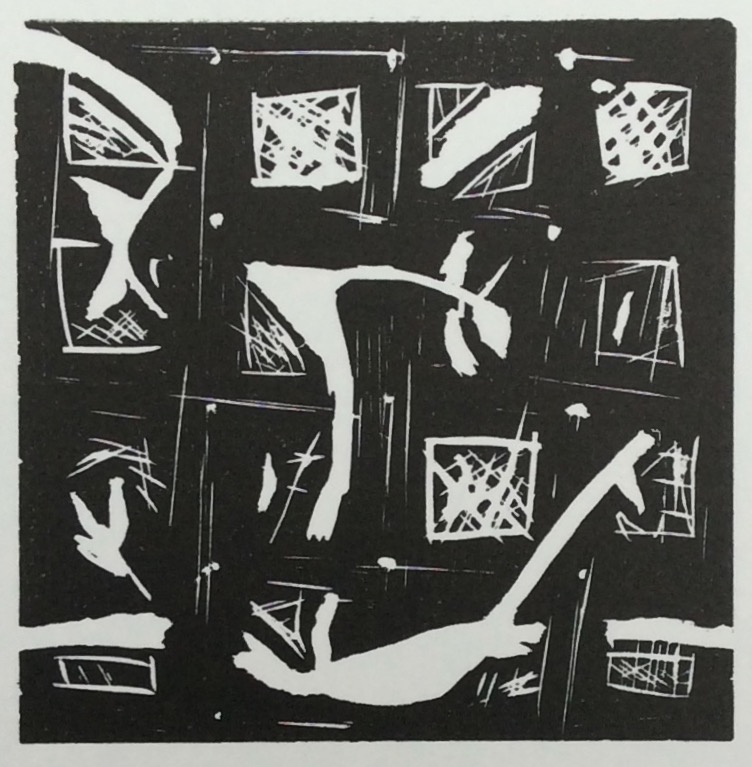
On a visit to the collections at The Keep (Brighton) the students were introduced to a range of nineteenth-century illustrated books. They were encouraged to produce critical and creative writing inspired by the images and texts they had seen. In a final workshop led by guest artist Peter S. Smith, they created their own linocut prints. A montage of the students’ lino blocks can be seen below.
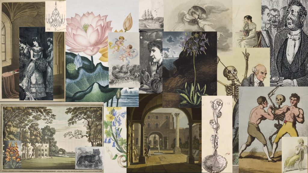
Visiting The Keep to see allowed the students to understand illustrations as physical objects, experiencing their original scale, the texts around them and the size, weight and binding of the books that they were published in. Such information that is difficult to convey in photographs and online. The image below is a virtual collage of just some of the illustrations that they saw. Printmaking enabled the group to understand some of the artistic and technical processes involved in creating a book illustration.
The students began by defining archives, illustrations and exhibitions in their own words. The sections of this exhibition follow these concepts. First of all, they considered the question What is an archive? Their definitions can be found below:
Archive
“A lot of information packed into one place”
“A place where documents are placed or stored”
“An area that contains vast amounts of information”
“Old things that have been documented”
“Origins”
“Ancient library.”
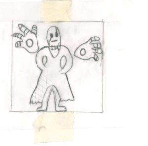
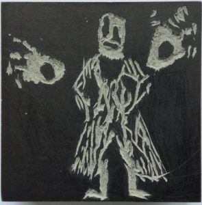
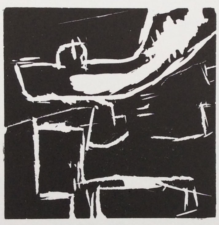
In making their own prints, the students’ task was to distil a strong single image from the array of books that they had seen. Some responded to the motifs in botanical, fashion and gothic illustrations, while others produced more abstract compositions.
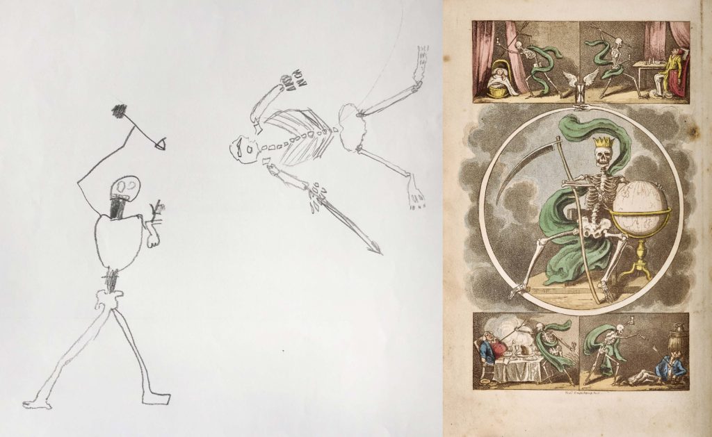
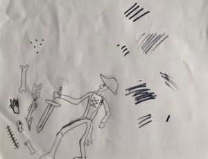
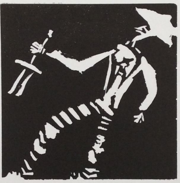
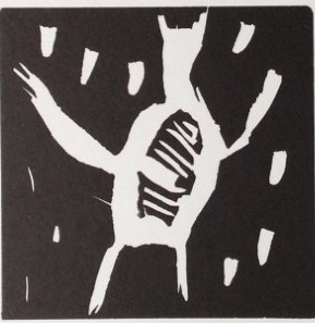
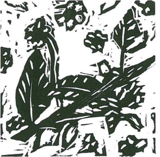
This student’s lively sketch was inspired by Isaac Robert Cruikshank’s frontispiece to The British Dance of Death (1823-1825).
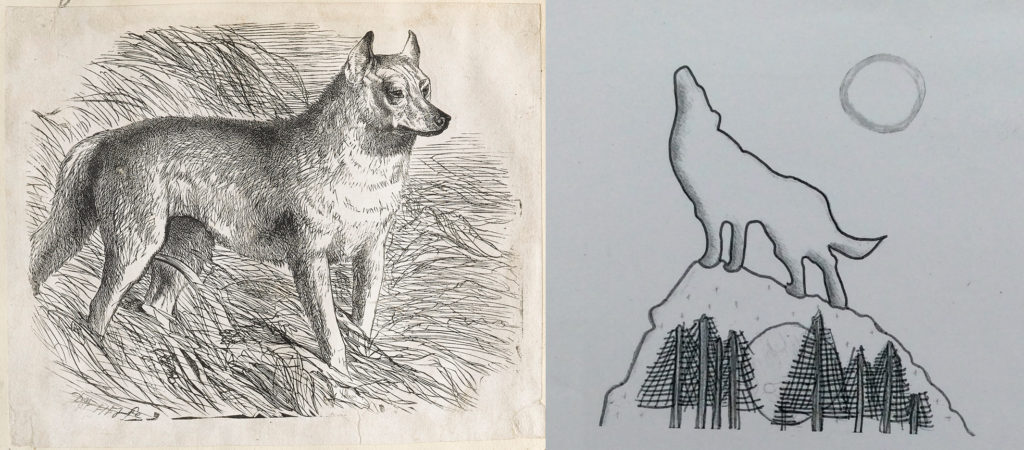
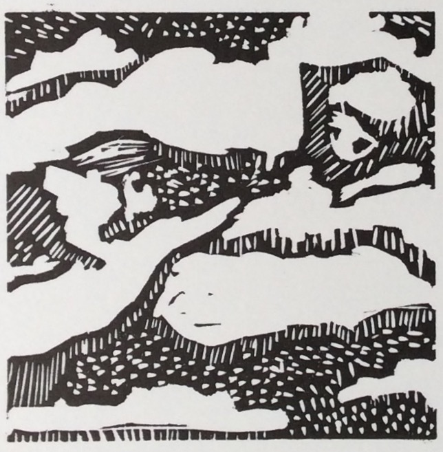
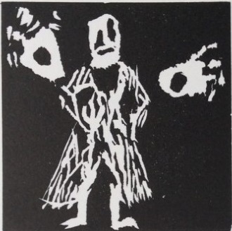
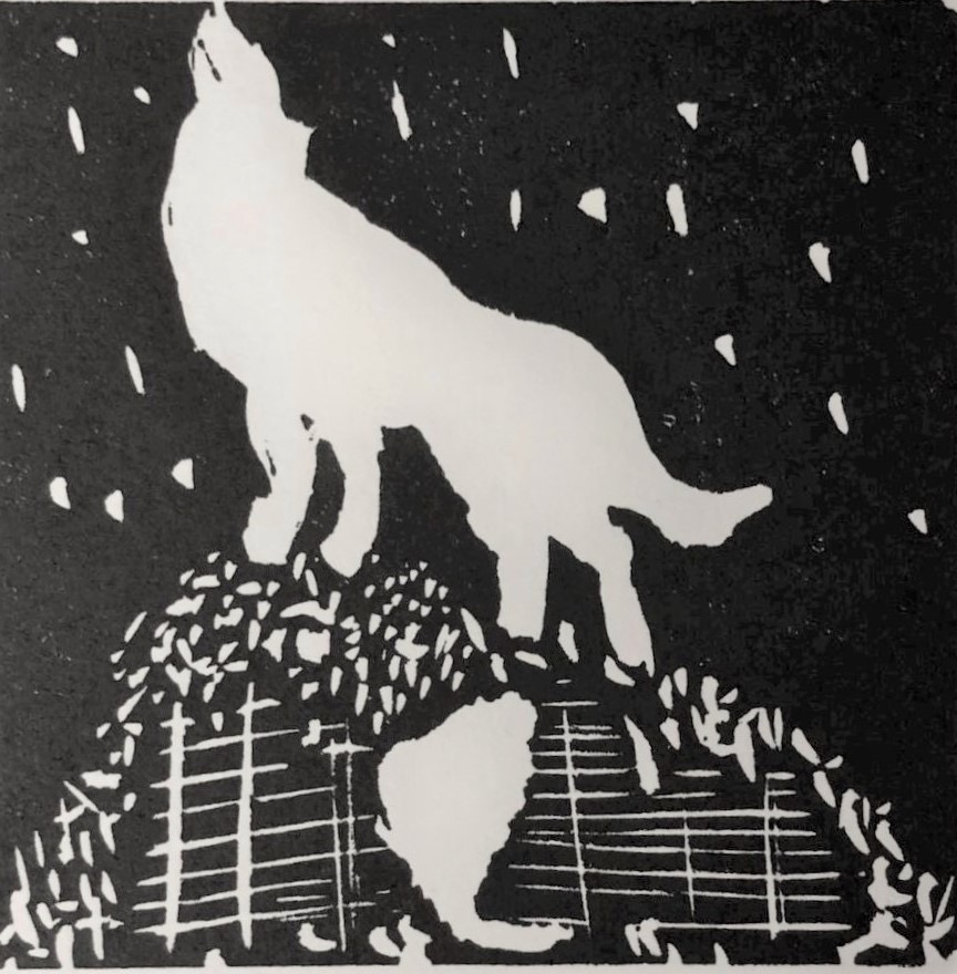
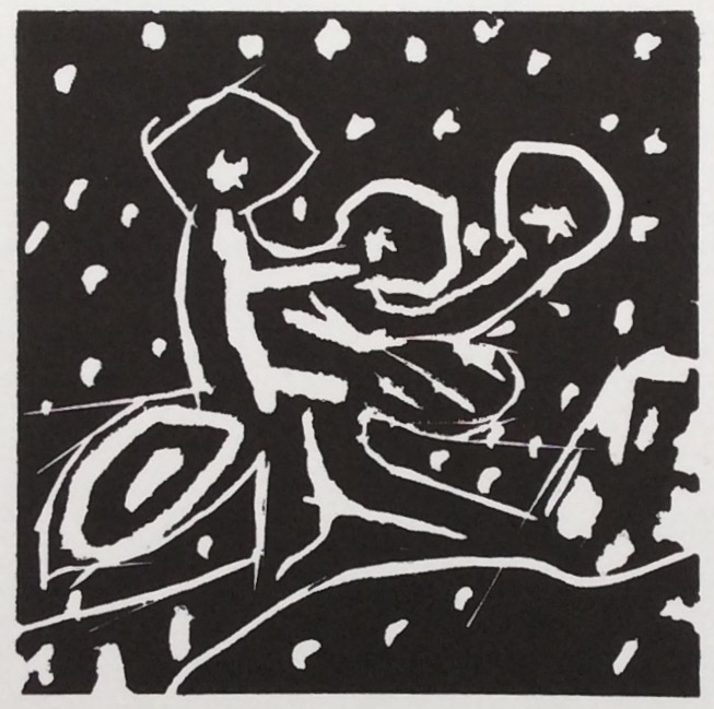
This economical yet effective drawing below invokes the atmosphere of ghost stories while echoing the Victorian natural history illustrations like Dalziel’s wood engraved illustrations for the Reverend J. Wood’s Illustrated Natural History (1861-1863).
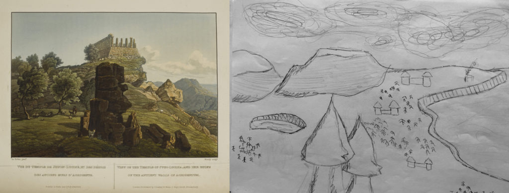
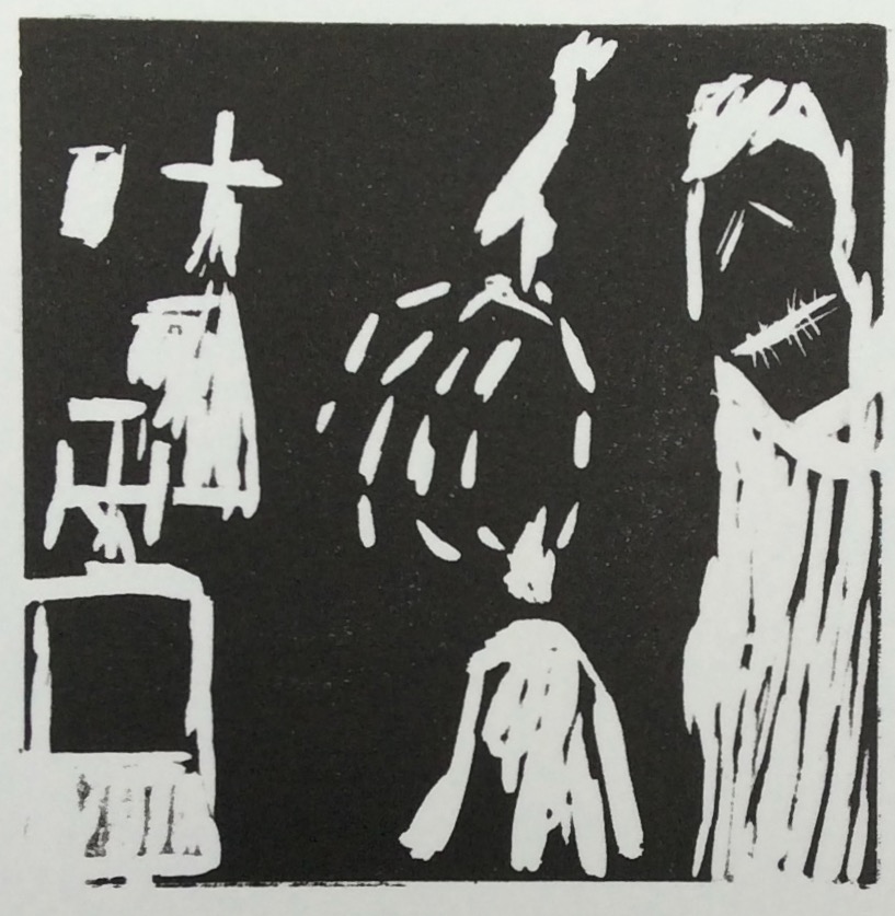
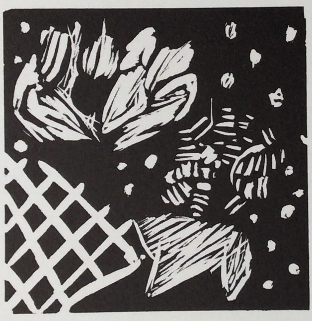
A wonderfully detailed drawing with great depth inspired by some of the luxurious landscape illustrations seen in the workshops including Select Views of Sicily (1825).
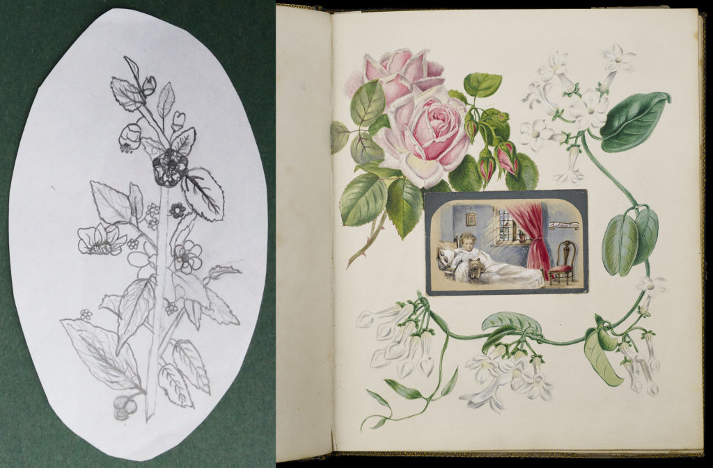
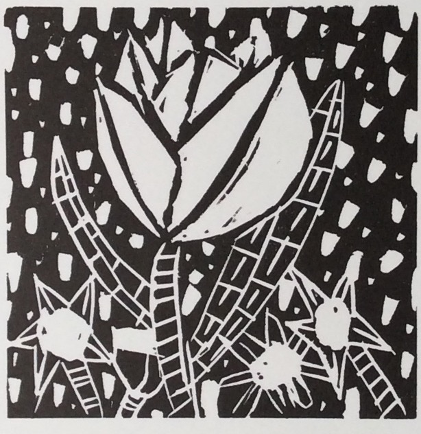
A beautifully shaped floral design corresponds with the page layouts and paper craft in The Donisthorpe Album which dates from between the 1860s and 1870s.
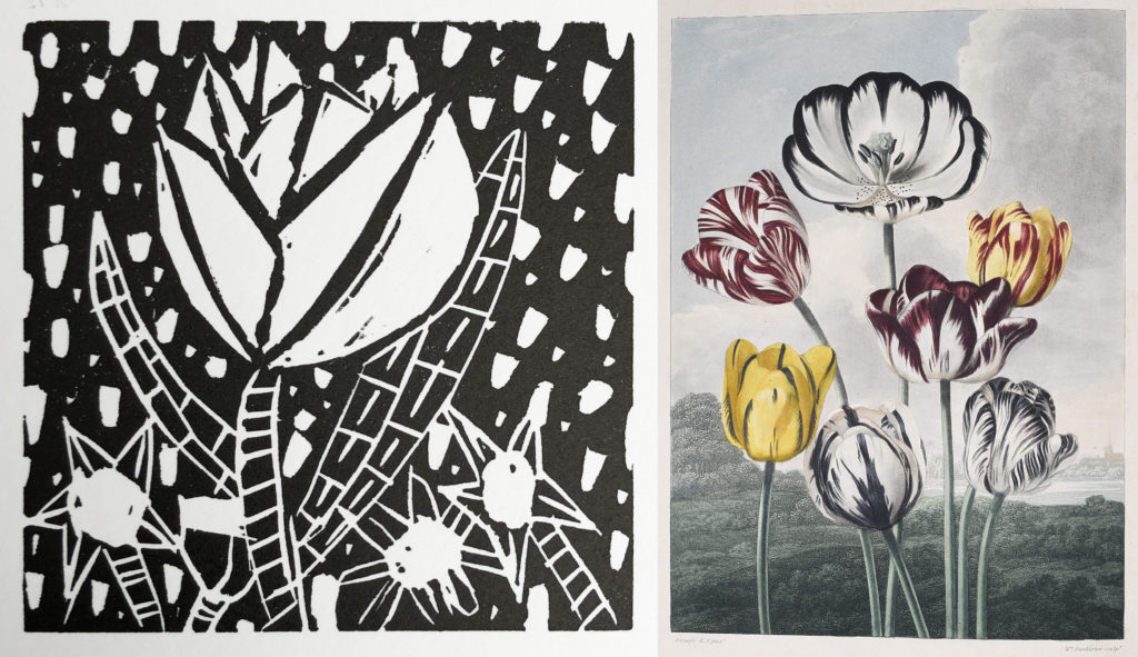
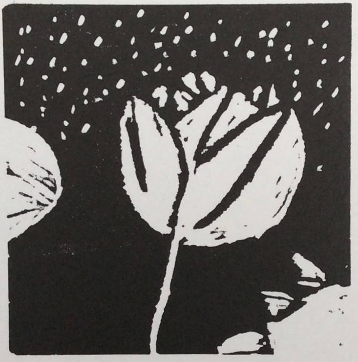
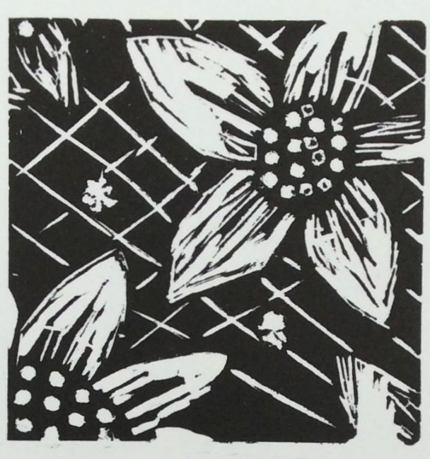
The floral design in this student’s print takes inspiration from the forms and patterns in The Temple of Flora (1799-1807).
Illustration
Students defined an illustration as:
“A drawing in a book”
“Drawings in books that were drawn by illustrators”
“A drawing of some kind”
“A picture”
“Pictures in books or comics.”
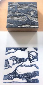
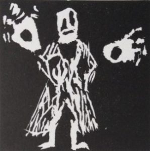
The workshop encouraged students to think of drawing as a starting point for an illustration which is often a printed image that can be reproduced multiple times and in different formats. They worked in linocut print because it is an accessible form of relief printing. In a relief print, the printed parts of the design stand out from the block (as seen below). Such methods were popular for illustration because they are compatible with letterpress. The Dalziel Brothers’ company specialised in wood engraving, which, although a more skilled and labour intensive form of relief printing, has some similarities to lino printing.
By making lino prints students could see the effort involved in making a print and witness how their drawings were transformed in the process. Their ideas were set out in initial sketches which were then simplified and transferred to the lino and run through the printing press. By making two impressions of their prints, they could see how levels of ink on the lino block and pressure in the printing press can affect the final result.
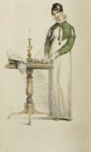
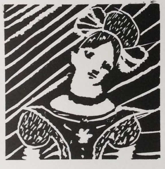
In this example an etched and hand coloured Regency fashion plate from Ackermann’s Magazine (1813), featured in the exhibition section Fashion and Gender provided a starting point for a student’s pencil sketch:
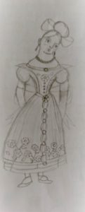
The drawing was cropped and dramatic lines added to the background on the lino block:
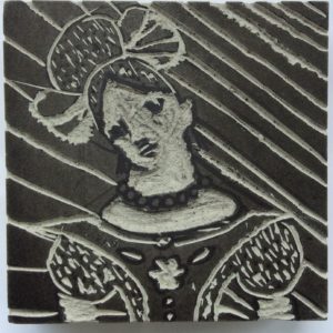
To achieve a powerful effect in the completed print:
An original drawing is transformed in the lino printing process. It is carved into the block with thicker lines:
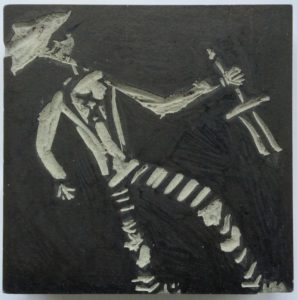
As a result, the original lines of the pencil drawing take on a much stronger form against the dark ink background in the printed image.
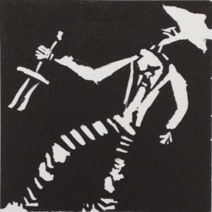
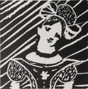
Tracing is a method by which print artists have traditionally transferred a drawing on to the block or etching plate. The drawing is reversed on the block:
The image is reversed again in the printing process so that it returns to the direction of the original drawing:
Despite using a small number of materials and a monochrome palette, the students have shown that there is not a single valid response to the archive, it enables unique and individual responses.
This project has introduced them to their local archives and encouraged them to feel a sense of ownership and creative possibility in the books that it holds. Their prints are displayed along with their definitions of an exhibition in the gallery below (click on each print to enlarge):
Exhibition
“Where you look at something in a museum”
“A showcase or display of something that you have made.”
“Where something important is on display”
“A place to show off different artefacts about a certain topic”
“A thing to show off”
“Things on display”
Student contributors: Alicia, Alisha, Cerys, Gordon, Jake, Lillian, Lucie-Lee, Nianna, Reuben, Robert, Rose, Sam, Sonny, Tamia, Thai.
Workshops designed and enabled by:
Dr Bethan Stevens, Dr Hannah Field, Dr Treena Warren, Professor Lindsay Smith (University of Sussex).
Lauren Howfield and Emily Jewell (BACA).
Richard Wragg (The Keep).
Peter S. Smith (Artist).
Online exhibition curator:
Dr Susannah Walker.