raughtsponship, or, ‘one small step for a pon; one giant leap for ponkind’
For International Women’s Day we’re proposing a new word: p’on. The word grew from a text conversation between Madeleine Hallward and Isabel Seligman and myself, and we hope it’s a useful addition to the language. For me, the need arose while writing my monograph on the Dalziel Brothers. I was already struggling with the awkwardness of juggling the words draughtsman and draughtswoman and then I tried to adapt the abstract word draughtsmanship, and came up with draughtspersonship, which felt like too many syllables to hold on the tongue.
So as an alternative, we would like to propose p’on, an abbreviation of person that can be readily substituted for man, and can be spelled with or without an apostrophe. Other good uses in the arts include camerapon, craftspon and craftsponship. It is an ungendered way of adapting many essential words, and it simply involves changing the ‘m’ sound for a ‘p’. Uses include salespon and salesponship, statespon and statesponship, brinksponship, ponkind, chairpon, businesspon and many others. Phrases we like include: ‘my good pon’; ‘the right pon for the job’; ‘a pon with a van’, etc. We like using the word ‘person’ as a friendly substitute for the critically loaded term ‘human’.
Today Woodpeckings celebrates craftsponship and draughtsponship particularly among the women artists who worked in the Dalziel wood engraving firm, both as designers and engravers. We particularly remember outstanding work by Jemima Blackburn, Mary Ellen Edwards and Margaret Dalziel: three of many. (Behind this is a longing for another word, a workable, ungendered term for masterpiece.)
Margaret Dalziel started working with the Dalziel firm in 1851, continuing for four decades until her death in 1894. Her long history at the centre of this powerful family of image makers reminds us of how inadequate is ‘The Brothers Dalziel’ as any kind of description of the many artist who worked under the Dalziel signature. At present, it’s not possible to separate out Margaret Dalziel’s individual engraving work from that of John, George and Edward Dalziel. Nevertheless, this absence of record means it is vital to pause and think through her craftsponship: she both is and is not the author of every Dalziel engraving. On International Women’s Day I want to remember Margaret and think about her as one creator of three Dalziel works designed by Jemima Blackburn and Mary Ellen Edwards.
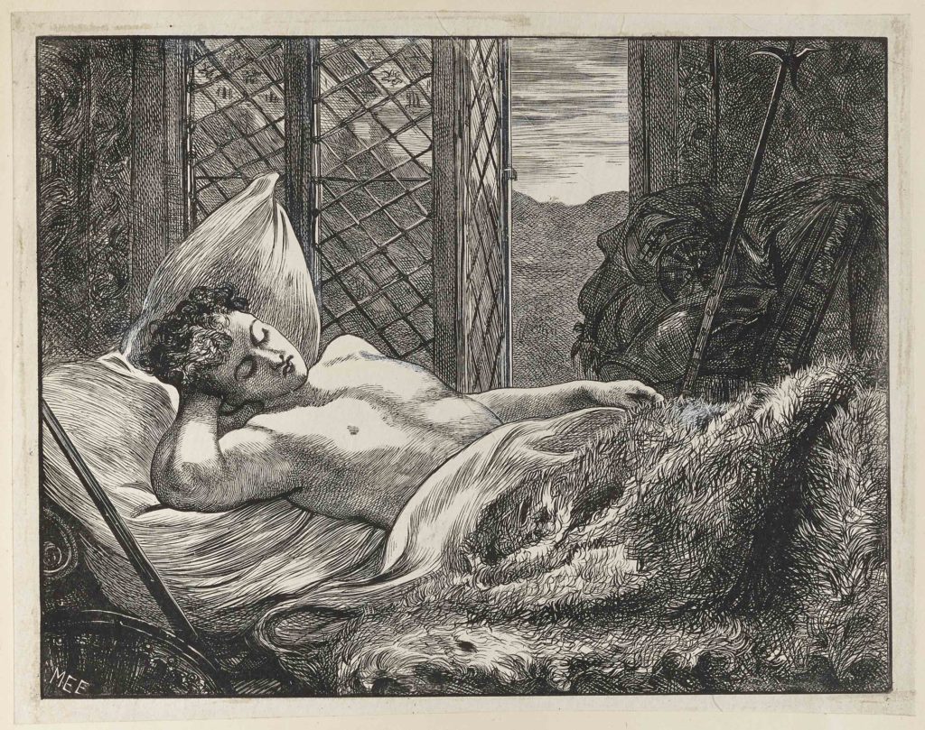
Edwards was a well known draughtspon who and prolific illustrator of magazines, fiction and gift books, often taking a striking, critical gaze to contemporary subjects of modern life and middle-class luxury (see Fletcher, The Post-Pre-Raphaelite Print, and Kooistra, Poetry, Pictures and Popular Publishing). While her work is usually dominated by domestic scenes with clothed figures, in figure 1, from ‘Redstone Tower’, we are instead confronted with an exploration of heterosexual erotics, and a female gaze on male flesh.
Here, the luminous blank chest of the youth is the focal point for a visual and tactile pleasure that plays across the whole block, as the eye dances from the warm depths of the fur rug (reminiscent of Dalziel’s engraving work in 1864 for Millais’s Parables of Our Lord), to the bold lines of the furniture in the extreme foreground (bottom left), and the hazy lines of the shadowed walls on either side of the latticed window. The well-known MEE monogram would have proclaimed Edwards’s female authorship (with the playful homonym ‘me’ echoing in the signature). While its ostensible subject is a sleeping youth, the desired object here is equally the invisible sun, celebrated through light and warmth remembered on the woodblock. The crumpled uniform and abandoned weapon add to the peace of the scene, even as they threaten to cut.
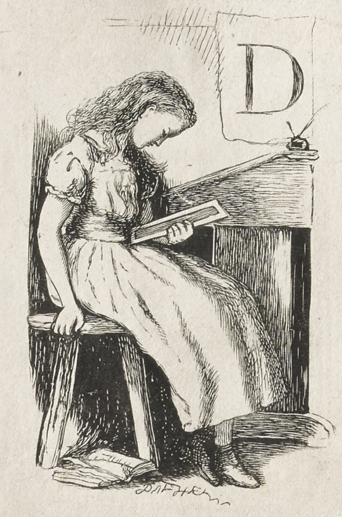
These sorts of intricate fine textures were just the engraving effects Margaret Dalziel would be remembered for. Her contemporaries noted that she worked on ‘the most highly finished engravings’ and that her work was ‘distinguished for minute elaboration and fine feeling’ (Dalziel, A Record and Gleeson White, English Illustration, ‘The Sixties’ (1897)). Indeed, ‘minute elaboration’ would also be an apt descriptor for figure 2, an illustration of Queen Mab carrying off the swooning Tom, published in Charlotte Yonge’s children’s novel, The History of Sir Thomas Thumb (1855).
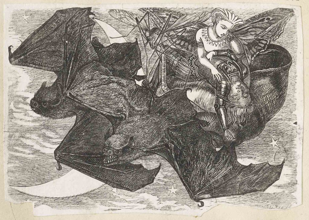
This book again is centred around women’s production, with Yonge’s text fully illustrated by Jemima Blackburn, whose stark ‘J.B.’ monogram appears on the title page. Figure 2 is just 8cm high; remembering this helps to convey the craftsponship here. Startling networks of lines are created through an inextricable collaboration between draughtspon and engraver. Look at the way tone is created solely by solid blacks. There is a confident display of immensely varied textures, from the sheen of the bats’ bodies, to the subtle, stacatto abstraction created by the crane fly’s legs, and the lyricism of the sky and Mab’s butterfly wings. Again, the fainting figure of Tom and the active desire of Queen Mab make this a fascinating subject for women artists.
Jemima Blackburn was one of many women who worked regularly for the Dalziel firm. Born in Edinburgh, she developed her draughtsponship throughout her life; Rob Fairley’s DNB article notes how she ‘kept a visual journal… from the age of twelve, describing the day’s activities’. Blackburn’s work for Dalziel clearly draws on her ongoing interest in natural history (note the careful observation of those bats). Nevertheless, her work was particularly focused on children’s and relgious subjects. While these were doubtless seen as particularly suitable for a woman artist, the genres also lent themselves to exploration of the most serious and ambitious subjects. For me, one of Blackburn’s most haunting works is figure 3.
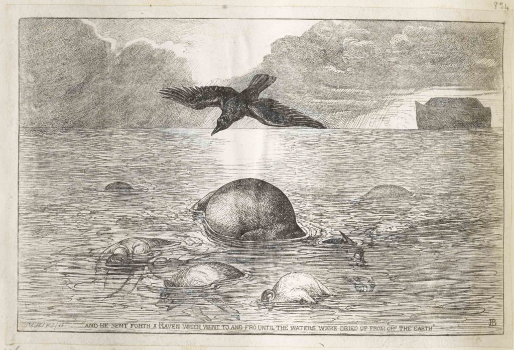
Part of a series, this illustrates the biblical flood, taking the Christian text as occasion for exploring a bleak view of global history. Blackburn is not afraid to confront the horrifying tragedy of the Book of Genesis, for people and animals together. In this block, the work is simple and mesmerising, rather than intricate. Look at the repetitive patterns of line that create the texture of the water, and then at the distinct but also repetitive pattern used for the sky. Note too the simple modernity of the ark. All this quietness serves to highlight the terrible scene of loss in the centre. This wood engraving stands alone as an image of mourning, even as the luminous sky and the rain whisper of a rainbow that may appear.
From fantasy and desire, to deep tragedy, women artists created a vast body of engraved work under the signature of the Brothers Dalziel. It’s crucial to take time to think about engraving authorship and remember that women were involved at all levels in these images, from draughtponship, to managing illustration within powerful engraving families, to working as precarious freelancers. We cannot know which of the Dalziel engravings was made by Margaret Dalziel, we are left with the knowledge that every single one – impossibly – both isn’t and is.