Lorraine Janzen Kooistra is Professor of English and the Co-director of the Centre for Digital Humanities at Ryerson University, Toronto. She is co-investigator on the Children’s Literature Archive (CLA) project and the founder and principal investigator of the Yellow Nineties Online, a digital research environment for the study of aesthetic periodicals of 1890s Great Britain. Her many publications on Victorian illustrated books and periodicals include: The Artist as Critic: Bitextuality in Fin-de-Siècle Illustrated Books; Christina Rossetti and Illustration: A Publishing History; and Poetry, Pictures, and Popular Publishing: The Illustrated Gift Book and Victorian Visual Culture 1855-1875.
Wood-engraved Pictorial Initials in Victorian Periodicals: Some Assembly Required
I have spent my career studying Victorian illustrated periodicals and books. Much of my attention has been directed to poetry illustrations, but lately my work has taken a more ornamental turn: I have become fascinated by wood-engraved pictorial initial letters in magazines. Purpose-made for the verbal texts they accompany, these tiny amalgams of alphanumeric and iconographic code shaped the reading interface of historical readers, but as critics of Victorian periodicals we have largely ignored these ubiquitous signifiers.
The Wellesley Index to Victorian Periodicals 1824-1900 (1965-1988), and its companion, the updated Curran Index, have been foundational to the study of nineteenth-century magazines and newspapers. Valuable as these indexes of authors are, their design also speaks to a long-standing bias toward the verbal contents of Victorian periodicals. To this day we have no comparable index of the thousands of artists and wood-engravers who provided visual content to periodicals until the end of the century, when wood engraving was replaced by process reproduction and hand-drawn images by photography. Between 1839 and 1893, George and Edward Dalziel dominated the wood-engraving industry: they cultivated and promoted artists, trained wood-engravers, and used a factory-type system to produce facsimile engravings of biographic, comic, decorative, geographic, literary, political, and scientific illustrations. Their Proofs Books—page after page of wood-engravings for many of the period’s most popular magazines—provide a glimpse into a print culture dominated by visual, rather than verbal, content.
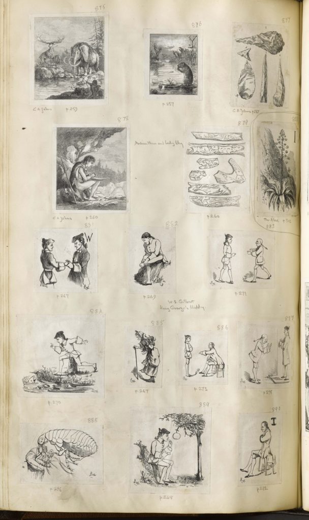
A single page from a single Dalziel Proofs Book for 1869-70 gives a glimpse into the variety of small images prepared for a monthly issue of Good Words for the Young. This single page contains engravings of fossilized spear heads, a botanical drawing of the aloe plant, anthropological recreations of ancient life, small sketches that appear to illustrate a work of historical fiction, and a terrifying image of a giant bug overpowering a man waking up in his bed. There are 16 tiny engravings in all, none more than 2” x 2,” each designed by an artist, engraved by an engraver, and then printed as individual proofs and pasted onto the page, with a hand-written indication of the destined periodical page number, and sometimes the name of the artist and title of the work as well. Five of these engravings belong to the visual category of pictorial initial letters, but the one that intrigues me, as a Canadian scholar, is the miniature scene of iconic Canadian wilderness, with the national symbol of the beaver in the foreground, a mate swimming in the middle ground, and the letter “Y”—presumably the result of the rodents’ activities—formed out of birch branches in the upper right, against a sunrise in the background.
Initial letters occupy liminal places in the verbal and visual languages of Victorian periodicals. As representational scenes they form units of semantic meaning using the linear black-and-white code of wood-engraving technology. Carving out the negative spaces so that the sun, birch branches, and water lilies can emerge from the ground of the page, the engraver created texture, pictorial depth, and shadow out of the lines left in relief to receive the ink. Throughout the pages of Good Words for the Young, multiple, unique instances of pictorial letters create a visual syntax that orders the layout of individual pages and adds continuity to the issue, while also aiding the navigation function of the interface by marking the start of texts and the places for readers to pause and reflect. Pictorial initials demand pause because these lisible units require assembly by the user in order to function effectively. Having identified the start of a text by locating its pictorial initial, readers must then interpret the vignette as a guide to textual contents, discover the visual object masquerading as an alphabetic letter in its upper right corner, and connect that letter to the first word in the adjacent letterpress in order to read the verbal content. In this sense pictorial letters participate in the semantics and syntax of two languages, visual and verbal.
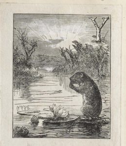
Without reference to the verbal text this pictorial initial “Y” was designed to accompany, I can infer much from the minimal meta data provided by the Dalziel Proofs Book, which tells me that the initial was produced for the March 1869 number of Good Words for the Young, where it appeared on page 257. Although copies of Good Words for the Young are readily available, in both print and digital versions, I wanted to take advantage of the Proofs Book’s text-less imagery and read the pictorial letter without the distraction of linguistic noise.
This little postage-stamp-size pictorial initial was engraved in 1869, two years after the Confederation of the Dominion of Canada made a nation out of a group of colonial holdings north of the 49th parallel. The visual language of the pictorial initial is so iconic that it remains legible today, with its references to the rising sun, the industrious beaver, and the pristine wilderness of a supposedly uninhabited new land rich in raw resources. Canada was opened to Europeans largely through the fur trade, and the beaver, as one of the most sought-after pelts, became the brand symbol on the coat of arms for the Hudson’s Bay Company as early as 1621. Later, the beaver became a national emblem for Canada itself. This year, 2017, is the 150th anniversary of Canada’s confederation, an act that attempted to unite British and French traditions into a shared nationhood, but which failed to confederate the first nations peoples whose indigenous knowledge opened waterways to the fur trade that provided beaver hats to the empire.
In discovering this little pictorial initial of a Canadian wilderness scene in the Dalziel Proofs Book for 1869, I am reminded again how important it is to recognize the ways in which different languages and histories collaborate, collide, and effect meaning together. As small markers of difference on the periodical page, pictorial initials continue to challenge readers today to pause and reflect on how the iconographic language of symbols continues to mediate and condition our meaning-making practices and reading experiences.
Lorraine Janzen Kooistra